Archive for March, 2008
Sometimes Design Turns into Perfection - With the Help of Others
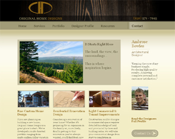
Wednesday, March 26th, 2008Ok, I’m gonna brag a bit here. Just completed a new site for a architectural home designer in British Columbia, Canada. The final result fits my client and his business perfectly. It has an architectural look about it and the color scheme matches the semi-arid mountainous terrain in the region his homes are constructed. I think it’s perfect, but I’m a tad biased, of course. ![]()
Now it’s not 100% original as nothing in design ever really is. We all take inspiration from others and blend ideas to build our own creations. So here is the process that came to develop this great design.
It Began with a Logo
![]() First we started with designing a new logo by holding a logo contest. The final logo was clean, simple, and turns out to be very versatile. Trevor, the design team leader over at Geekpoint.net was the designer. This¬Ý logo then helped to determine some of the color schemes for the site.
First we started with designing a new logo by holding a logo contest. The final logo was clean, simple, and turns out to be very versatile. Trevor, the design team leader over at Geekpoint.net was the designer. This¬Ý logo then helped to determine some of the color schemes for the site.
Layout and Color Schemes
The client had presented some print brochures and posters from a window manufacturer which helped to set a direction. I had some initial ideas of basic layout and placement of elements but needed something else to help tie it all together.
When I’m stumped on design ideas I browse the CSS web design gallery sites like these; csswebsite.com, cssbeauty.com, cssheaven.com and others. These sites showcase the best in current web design trends with a focus on standards complaint HTML (hyper text markup language) and CSS (cascading style sheets) coding.
After browsing through dozens and dozens of sites I came across these; andrewbradshaw.com and cabedge.com. So to give credit where credit is due here is what we liked about these designs and the elements we incorporated into the OHD website.
Header and Navigation
 On Andrew Bradshaw’s site I liked the header and navigation menu, particularly how he had separated the menu with that divider. I used a similar separation to move the Contact tab above the right sidebar. This helps to highlight the contact link since having visitors contact the architectural designer is the primary goal of this website. I then hunted down the perfect background image at istockphoto.com to incorporate an organic natural look of wood.
I also used his technique of separating colors in the logo text to highlight the word design. I then did a mirror image of that technique on the other side with the phone number.
Color Schemes and Presentation
 The Cabedge website had pretty much the layout I had originally envisioned with the narrow sidebar, the big showcase box and three columns below to highlight the main services of my client. The Andrew Bradshaw site actually uses a similar layout too. More importantly here with Cabedge was their color scheme for the main content area. They were using similar background colors to the Marvin Windows brochures I had. As soon as I saw their site I thought, “that‚Äôs it”.
I re-created their background gradient image in Photoshop using similar colors while changing up the rate of fades a bit. I used thick (not as thick) borders around images and went slightly darker there too. Font colors are similar for the content while we used the gold of the new OHD logo as the colors for headings and subheadings.
Visual Effects with Java Script
Drop Down Menus
Drop down menus for site navigation are a great usability tool but add complications in designing a site to work across multiple web browsers. Various browsers have their quirks on how they interpret CSS code. Internet Exploder (explorer) in particular has issues with handling pure HTML/CSS drop menus. So to solve that we like to use the suckerfish method. Some java code helps out IE while other browsers can function fine without it and maintains a search engine friendly navigation structure.
Slideshow Presentation
The slideshow in the big box on the home page is not flash animation. I don’t work with flash. Instead it’s actually search friendly HTML with some java script to create the effects. We used SmoothGallery 2.0 and modified the script and stylesheets a bit to place the text portion off to the side and allow it to fade in instead of slide up and down.
Portfolio Gallery
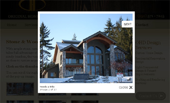
The individual galleries for the home design portfolio pages use the LightBox 2 script to overlay the images in a window without having to create a pop-up browser window. The way it greys out the rest of the page while viewing images allows the individual images to maintain priority when viewing them. And you can scroll through the whole set of images without having to close the window and open another. LightBox is a great script for presenting images.
Powered By WordPress
We used WordPress as a Content Management System which allows the site owner to easily edit their content and particularly so they can post information via a blog. Here the designer wanted to be able to write about developments in environmentally friendly home design and construction.
So there we have it. With the help of a logo designer, inspiration from a couple accomplished web designers, a few stock photography images, some cool java scripts created by others, and the open source WordPress software we’ve pulled it all together to create a really amazing website.
Drive Conversions with Obvious Action Boxes, Buttons, Links
Friday, March 14th, 2008For the average small business website, particularly local businesses, your website often has only one goal, or maybe a few at most. Primarily it‚Äôs to drive visitors to initiate contact and become a sales lead. Using “Action Boxes”, buttons, even calls to action links can really help to drive your visitors to your intended site goal.
The vast majority of small business websites are not selling product or services directly online. They provide their services out in the off-line world while the website is simply a marketing vehicle. These types of websites should not just be a digital brochure that simply says “Hi, we do this. Give us a call at this number”. You need much more in order to drive those visitors to call, or send an email.
Here are some example’s from some of my clients sites;
Action Boxes & Buttons

Body Balance Massage and Day Spa in Springfield, Missouri uses its action box at the top of the right side bar to encourage visitors to book appointments directly through the website. The action box is very visible and the orange arrow really draws attention to the link. The eye is drawn there before visitors even read the main body of the page content.
Being that they are located outside of the city the website helps to pull their customers from within the city (local search optimization helps). Also the line “We‚Äôre only 15 minutes from Springfield” lets people know its worth while to take a short trip out of the city for a day at the spa.

The “Start” button here on the autoprotectors.com website is extremely effective. It gets visitors searching for automotive paint protection kits for their particular vehicle. The website tends to attract more people looking for window tinting as the paint protection film (PPF) is a rather new product in the industry that not many know about or directly search for. The website is designed to showcase PPF and create more awareness of the product in their market area. Many people have told them that the first thing they want to do when landing on the site is click on the Start button.
Call to Action Links
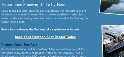
Here we‚Äôre not using an action box or any buttons, perhaps during the next time we revamp the site we may, but we placed big bold “call to action” links after the first section of the home page content. We added another one at the bottom of the home page to catch those that have scrolled down that far.
Instead of simply relying on the Contact button up in the navigation menu these call to action links, that simply link to the contact page, help to drive visitors to the contact page where many end up sending an email. Initiating contact about renting a boat on Shuswap Lake is the prime directive of the website. The site is very simple, no technical web applications, but it’s quite effective.
It’s All About Driving Conversions
These techniques are actually quite simple, even obvious. As most web users are quickly scanning pages for something to click on you simply have to give them something they can find easily and click on. It’s just a matter of taking a little time during the design phase to implement them and use the type of action box or button, or call to action links that are appropriate to the design and the business.
Make them big, make them stand out, and more web visitors will click and increase the chances of the site achieving its desired goal; converting web visitors into customers.
Speaking of conversions, how do you track web conversions when your small business website does not actually sell stuff directly online? I have a future post on that one coming up.
RSS Feed
The Topics
- I’m Such a Nerd - Now a Wine Nerd
- An Ode to a Very Special Little Rescue Dog
- Centering a Div in IE9 Using margin:auto
- Playing with HTML5 for First Time
- My Wife is a Food Blogger
- Designing and Coding a Mobile Version of your Website
- A CSS Sticky Footer that Works in 2009 (Chrome too) (343)
- New iGoogle with Left Nav Bar is the SUCK! (194)
- My Cool Ass CB750 Cafe Racer (115)
- Centering a Div in IE8 Using margin:auto (19)
- The State of Local Search in Canada (14)


Recent Stuff
